PLOS ONE’s New Look: Redesigned for Discovery
The PLOS Product and Development teams are constantly working to enhance the web experience for authors, editors, and readers. Today, we’re unveiling the latest update to PLOS ONE. Here’s an overview of what’s new:
Navigate Faster with Figures
The PLOS ONE home page now features a new way to discover and explore the latest research. Instead of seeing a list of articles, you’ll see a grid of articles each presented with a key figure. Hover over the figure for one-click access to the article’s abstract, figures, or full text.
 Subject Area Browsing
We’ve introduced a brand new way to navigate the research that PLOS ONE publishes across the entire spectrum of subject areas. Dive in by clicking “Subject Areas” at the top of every page. Once you find your preferred topic, click “View all articles” to get to one of our new subject-specific browse pages.
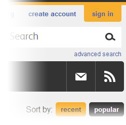
 These new pages feature a grid just like the home page, sortable by most recent or most popular allowing you to easily navigate all of PLOS ONE’s research articles. If you prefer, you can switch to a more traditional list of articles. If the subject area you’re browsing isn’t quite what you’re looking for, click the arrow to the left of the subject header to navigate one level up or down our taxonomy.
 If you’ve found the right subject area for your research, you can click the mail icon to sign up for a weekly email alert for that subject area, or the RSS icon to subscribe to that feed.

As always, the article page gives you one-click access to the Article Level Metrics (ALMs), author information, comments, and related content.
More to Come
You can expect ongoing improvements to the PLOS ONE web experience. As always, we’ll be looking to the community for feedback and suggestions. Feel free to leave a us a comment below.
